Crowdsourced air quality monitoring for iPhone reporting data from more than 32,000 sensors across six continents. Download Local Haze for free on the App Store.
Summary
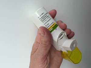
After being prescribed an inhaler for asthma symptoms, I wondered what was in the air around me. I already carried a mobile phone everywhere, so I wanted an easy, “on the go” monitoring experience to understand my local air quality. I did not want to have to carry another monitoring device.
After interviewing a dozen people with air quality concerns, I drafted a primary persona for an Air Quality Enthusiast – a non-scientist consumer concerned about monitoring outdoor air quality “on the go”.
As part of a small product team, I designed and launched Local Haze, a free iOS application that displays real-time local air quality sensor data and associated sensor confidence ratings. Collaborating with a software engineer/architect, I used an agile approach to launch a data-centric native iOS application displaying data from worldwide air quality sensors. My work included UX research, persona design, interaction design, branding and visual design, working cross-functionally with engineering to launch the app into the Apple App Store.
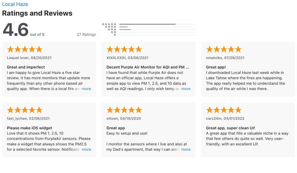
Since launching, Local Haze has maintained a 4.6-star rating in the App Store and is monitoring over 32,000 sensors across six continents. Local Haze is an example of collaborative product design and development processes to deliver an innovative native mobile app using publicly available APIs for air quality data.
Product video
As part of the Local Haze app launch, I created a product video to explain the need for consumer-accessible air quality monitoring solutions.
The design challenge
The EPA and the WHO have established guidelines for safe air quality, and health risks resulting from poor air quality, pollutants, and the presence of particulate matter (PM) are well known. Although many air sensors monitor the quality of the outside air, few simple tools allow consumers to understand the accuracy of local air quality measurements.
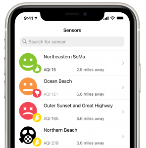
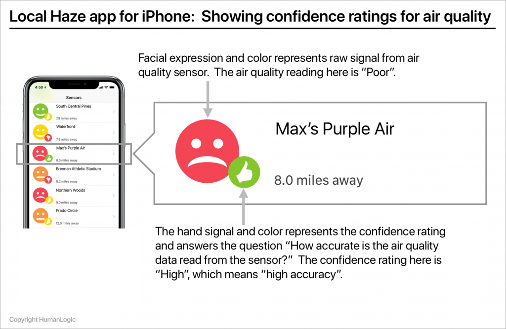
In the design of Local Haze, I set out to solve this problem by delivering accurate data in the form of confidence ratings for air quality readings from local outdoor air sensors. Local Haze aggregates quality-controlled crowdsourced air quality data and government sensor air quality data and delivers an easy-to-understand sensor reading confidence value to any iPhone. In a few seconds, a sensor’s reading and a confidence rating in that reading can be easily understood by a wide range of consumers. More detailed data about sensor readings is available with a single tap.
Local Haze validates the outdoor air quality data for a user’s location by crowdsourcing publicly available air quality data and then applying a confidence rating to the validation data. The app then displays this rating in an easy-to-understand user experience delivered to a device. Even though the AQ sensor data is rich and complex, a design goal for the user experience was to allow for a simple “at-a-glance” experience for users unfamiliar with air quality technology and terminology.
Aiming for a trusted user experience
We set out to design an experience for presenting a quantitative air quality data source — in an easy-to-understand format. We were also curious as to whether a design solution could be found to deliver an air-quality reading experience that a typical consumer would consider “trustworthy”.
Trust is important in data-centric experiences. Over the course of my career, there have been times when my work has been challenging because I have been tasked with delivering good user experiences in situations where the underlying data is inaccurate, or its accuracy is questionable. Perceived data inaccuracy does not help build trust with users — it often leads to distrust.
In this project, we aimed to address some of the challenges of perceived data uncertainty while improving the heuristics that lead to increased “data confidence” for end users.
Requirements
After interviewing a dozen people with air quality concerns, including a range of age groups and levels of health, I developed a persona based on a primary target user – the Air Quality Enthusiast. I began the design process by defining and prioritizing the Local Haze requirements, defining use cases, and writing user stories for the MVP version of the app.
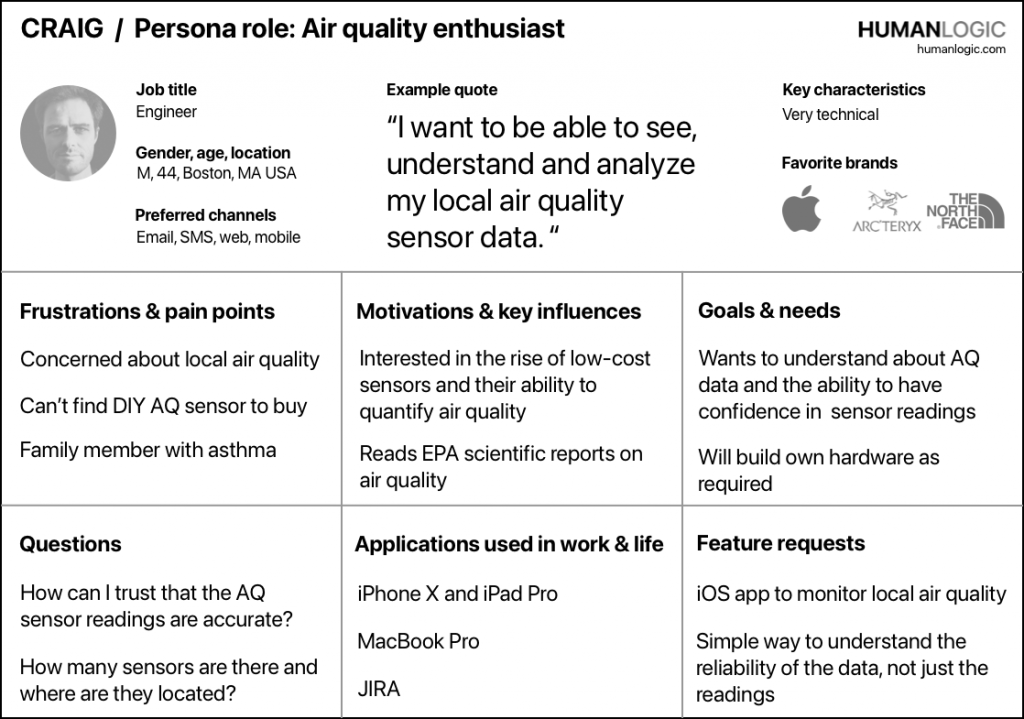
The primary use case for Local Haze is to enable citizen scientists who have installed their own air quality monitors to easily understand their local outdoor air quality. After talking to target users, we understood that our primary persona, the Air Quality Enthusiast – is highly motivated to track air quality through public environmental data sources and tends to purchase home air quality tracking devices connected to a home network.
We built a backlog of stories and prioritized development into sprints to get to an MVP release. While documenting near-term features, we also included longer-term features as part of road mapping.
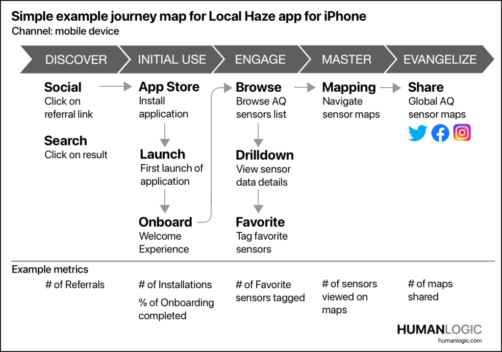
As part of our product planning, we developed a model of the user journey for the most common use case – discovery, download, onboarding, and then proceeding to view a list of sensors before drilling down into the details of the sensor’s air quality data. In subsequent releases, we updated the user journey to include additional mapping features and eventually purchase transactions.
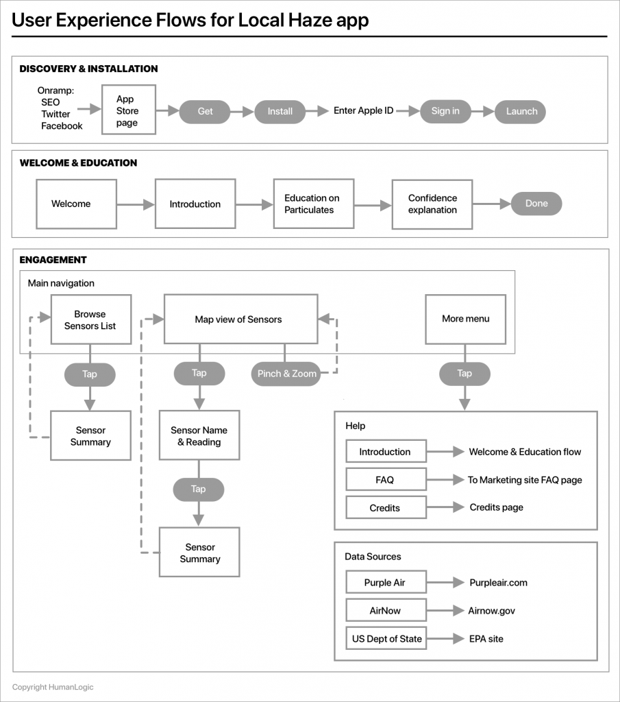
Application flows and data modeling
The primary flows for the MVP release of Local Haze included:
· An onboarding experience to drive knowledge about air quality readings, introduce the concept of confidence ratings and encourage discovery of additional features.
· Launching the app to see a collection of nearby sensors as the default view and associated drill down interaction.
· Displaying a geographic view of the sensors on a map with active pins and associated gestures for map interaction and drill down.
· Drilling down to view a detailed view of a specific sensor’s data.
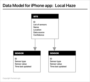
We defined a data model that expressed data from the air quality sensors and would allow us to show uncertainty. We defined a site object mapped to a single data source and associated with one or more sensors. This flexibility reflects that some of the sensors (such as the PurpleAir sensor) feature redundant sensors associated with a single site, providing an additional measure of accuracy.
Air quality measurements are commonly reported in terms of micrograms per cubic meter (µg/m3) parts per million (ppm) or parts per billion (ppb). For Local Haze, we needed to be able to present this information in qualitative ways that enabled an Air Quality Enthusiast to understand air quality quickly and drill down to the technical details if required.
The air quality sensor data for the Local Haze utilizes APIs from PurpleAir, Sensor.Community, uRADMonitor, AirNow and the U.S. Department of State.
Wireframes and navigation design
We produced early mockups to determine visualizations of the air quality sensor data that most clearly reflected the status of the sensors. Some initial mockups included placing actual numerical sensor values on the browsing screen — the list of sensors — an approach that was not included in the final design because it was seen as too complicated for a consumer user to understand quickly.
The original app navigation design used a tab control at the top of the screen to filter the view of the collection of sensors and a hamburger menu to access other major app areas. After testing this design on a phone, the approach felt clunky and involved gestures that required too much vertical thumb traversal across the screen.
After various tests on a phone, the final navigation design for Local Haze utilized a tabbed navigation controller at the bottom of the screen. This approach facilitated easier single-handed user interaction.
Visual design
During the early stage of the design process, I developed a simple visual language and branding scheme for the app. Local Haze gathers air quality data from devices worldwide, so one of the design goals for displaying information included reducing the reliance on words and instead using iconography and numerical values in the user experience. The color palette was designed to reflect brand attributes such as “trustworthy”, “simple”, “accurate,” and “vibrant”. An early version of the app’s visual design language is shown below.
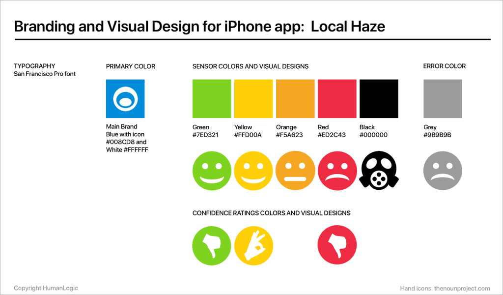
Local Haze’s user experience employs a clean, simple and colorful visual language in terms of color palette and iconography, representing the air quality index values as well as health impact. This visual language has been adapted over software releases to make it easier for users to understand the AQ readings and the confidence ratings.

One visual design challenge we faced was designing a layout for the sensor reading data while enabling it to be co-mingled with confidence data. Multiple design iterations resulted in a UI element that combines a sensor value and confidence rating into a composite element that works well with the display constraints of a mobile device.
Interaction model and app performance
Local Haze’s interaction model focuses on a single-handed “launch and view” experience designed to minimize user interactions while quickly presenting useful information. We felt that launching the app should immediately display the most critical information without any lag or the need for additional interaction.
We also assumed that single-handed use of the device would be typical for browsing collections of sensors via the scrolling gesture using the thumb. Drill down on the sensor collection utilizes the tap gesture to view a summary of sensor data. Navigation among the core app areas utilizes a segmented controller UI component placed at the bottom of the screen, following the Apple Human Interface Guidelines.
Performance is an important issue in the Local Haze user experience since accessing, preparing and displaying the sensor data can be computationally expensive. Early releases of the app resulted in challenges with performance, especially on first use while loading the default view of sensors. To address the lag issue, we used techniques such as “lazy loading” to improve the perceived performance in the user experience. I also worked with engineering to design a map visualization technique to summarize sensor readings, integrating clustering and the pinch-and-zoom gesture in native iOS. The Local Haze map now clusters sensor data based on the zoom level of map navigation, displaying a real-time summary of air quality sensor readings using color that is also easy to understand.
Business results
As of 2023, Local Haze continues to grow an engaged audience and now monitors over 32,00 air quality sensors across six continents while maintaining a 4.6-star rating in the App Store.
User feedback has been excellent and provides thoughtful commentary and requests for new features. In the last year, feature releases have included a subscription service for tracking AQ data for specific sensors and a new widget feature.
After the initial “Go To Market” release for Local Haze, we launched a marketing site and a social media program, including a Twitter account that features frequent postings of global air quality news. Air quality scientists, air quality enthusiasts, citizen scientists and manufacturers of air quality sensors are among the Twitter followers. The feedback and engaged discussion Local Haze has generated on the App Store and Twitter has led to requests for new features as new releases are developed.
Skills
User research, persona development, journey mapping, product design, interaction design, GTM
For more information
For more information on Local Haze please visit the Local Haze marketing site or visit the App Store to download Local Haze.
Credits:
Apple and iPhone are trademarks of Apple Inc., registered in the U.S. and other countries. App Store is a service mark of Apple Inc., registered in the U.S. and other countries.
All contents Copyright HumanLogic